Fitts' Law and Minimalism vs GTK+ and Qt
It all started with the Pidgin chat window, which is surrounded by several pixels of padding. To my eyes the padding doesn’t achieve anything, it just wastes space and detracts from the clean, minimalist lines of the Buddy List. After much fumbling, I managed to change it in the Pidgin source code . Bug 6987 with patch was duly filed. Now I’ve become obsessed, I’m spotting extra borders and pixels in nearly every application on my desktop.
Fitts’ law
Fitts’ Law: The time to acquire a target is a function of the distance to and size of the target. AskTog
Fitts’ law models the effort to point at something, for instance adjusting a scrollbar with the mouse pointer. A scrollbar at the very edge of the screen is much easier to hit than one inset by a few pixels. Effectively, anything at the edge of the screen has infiite thickness, so it’s very easy to hit. If there is a border surrounding the application, when it maximized the screen edge becomes useless. Firefox, Evolution, Gnome Terminal, Nautilus, Scite & others get this right. When maximized their scrollbar reaches the screen edge.
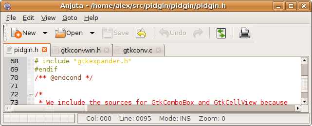
Pidgin, Gedit, Synaptic, MonoDevelop, Qt Designer, Glade, Anjuta & many more get it terribly wrong. The scrollbars are inset from the window’s edge by a few ugly, infuriating pixels. These applications need fixing and their designers subjected to aversion therapy.
The true culprit
In fact Pidgin and Gedit are innocent, they’ve been framed (so to speak) by GTK+.
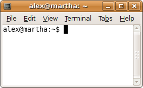
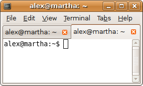
The GtkNotebook widget is the multi-tabbed container for GTK+ applications, such as these. GtkNotebook draws a thin border around anything placed on one of it’s pages, this border is unavoidably drawn when the tabs are shown. The effect can be seen by opening a new Gnome Terminal, maximizing it, then opening a new tab. The scrollbar shifts inward by a few pixels.
Firefox gets around this in some way I haven’t divined. Either it doesn’t use GtkNotebook or the GtkNotebook doesn’t contain the pages. Instead Mozilla seem to have implemented their own paging. For those using KDE, the message is mixed. Qt is no better - out of the box QTabWidget places a similar border around controls placed within it. Konsole 3.x suffers from this, although Konsole 4 & Kate 4 do not. Props to the KDE project. Microsoft Windows also fairs poorly, though Office 2007 pulls some new tricks. try maximizing Internet Explorer or Outlook.
How things should be
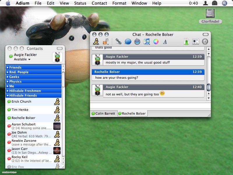
How can this be fixed? Should it be fixed? GTK+ and Qt implement their tabbed containers like this for presumably sane reasons, but it makes these applications harder to use and frankly it looks butt ugly to me. Many will groan at this, but from what I’ve seen Mac OS X gets this right. The lines are clean, applications look very uncluttered and everything extends to the edge of the window - there are few borders, if any. For instance, compare this screen shot of Adium to the earlier Pidgin screen shots.
I’m want Gnome or KDE to look just like Aqua, but they could simplify much along those lines.
Accessories to the crime
Dead space is present in other areas of the Free desktop. Often around scrollbars. On Ubuntu, with the Human theme many GTK+ applications, including Evolution and Synaptic, have padding between lists or text areas and their scrollbars. Some rehabilitation can be done with the gtkrc file or an alternative theme such as Clearlooks Compact. More in this next time.
